Rethinking Form Usability

Rethinking Form Usability

I Led the Research and Owned the Design System the redesign needed.

Instead of redesigning three screens on assumptions, I led research to understand our users properly — starting with foundational research, then testing iterations to find what actually worked.

  • Sales Invoice

    24 fields and 3 tables on one screen — the highest-traffic form in the product.

  • Journal Entry

    One template built to serve both adding and editing entries.

  • Stock Transfer

    Same slow pattern, on the screen managers relied on daily.

Where it started

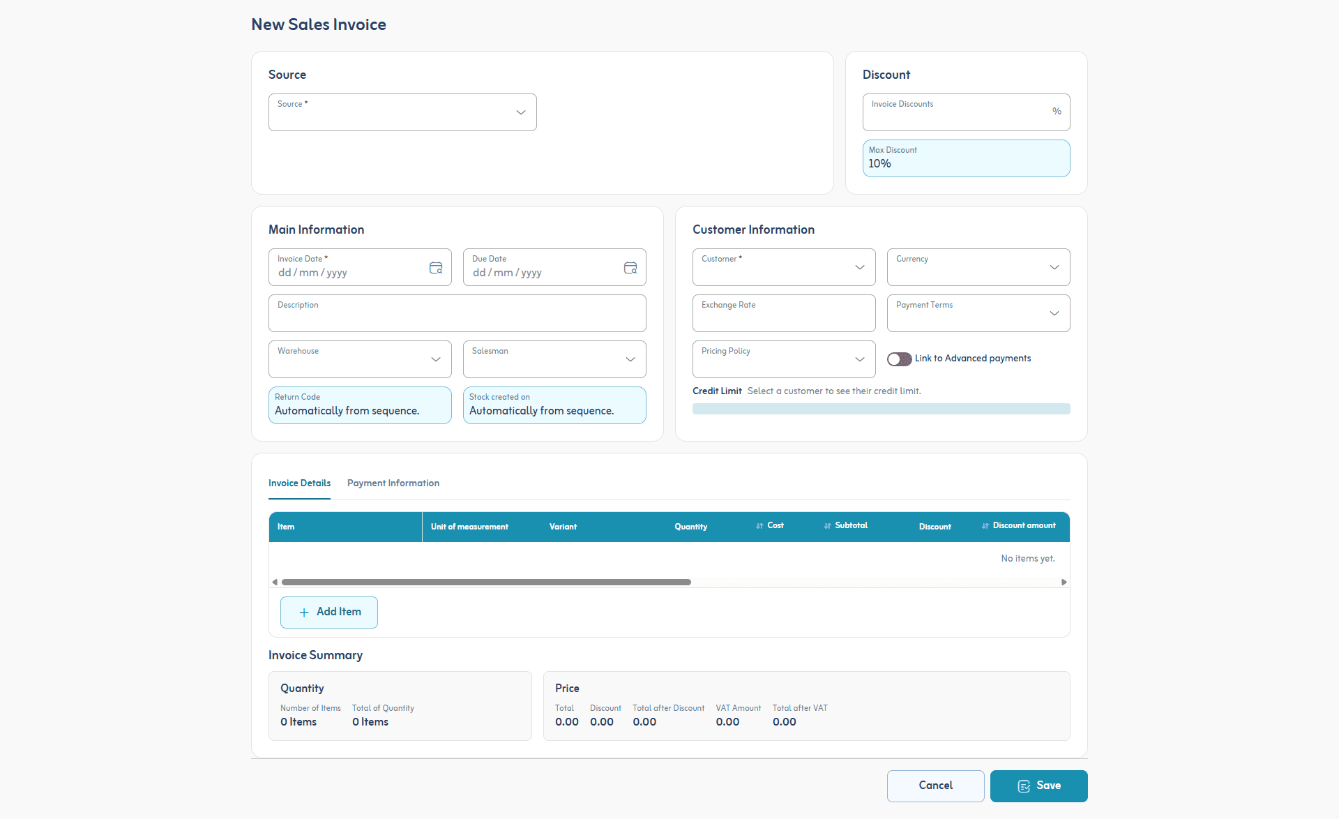
The legacy New Sales Invoice screen — four cards of form fields above a line-item table
  • Equal visual weight
  • No clear reading order
  • Real work below the fold
Sources:
  • Support Team Feedback on training

The playbook fix
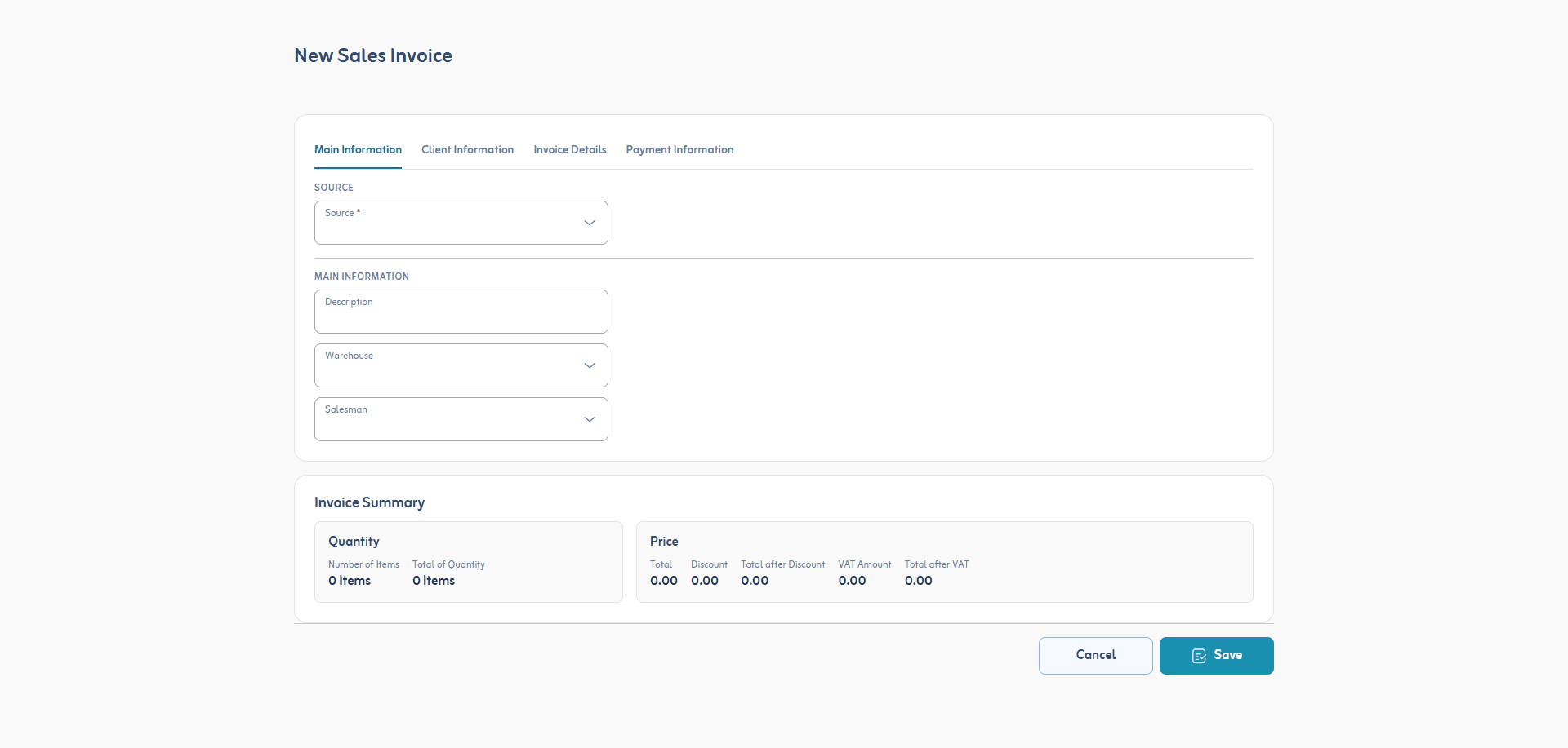
The tabbed redesign — four tabs above a single column of three fields
  • Four tabs replace the grid
  • Single column, grouped inputs
  • Just 3 fields per view

Standard advice for a form this size, applied as written — a reasonable, well-supported starting point.

The playbook made it slower

v1.0 — legacy
40s
v1.5 — tabbed
50s
v1.0 — legacy
40s
v1.5 — tabbed
50s
+25% slower than the legacy screen

Per invoice, measured to the first line item added.

Source:
  • 20+ sessions in an A/B Testing, excluding outliers

Why it failed

The tabbed redesign — the fields visible on the Main Information tab
  • Client Info is a tab away
  • Only 3 fields on screen
  • Same clutter, now hidden
Sources:
  • Interviews with clients directly

So I went and watched

6
sessions
20
minutes each
What software do they reach for day to day?
Excel
How do they interact with it?
Keyboard-first — mouse as a last resort

Salesmen and managers who fill out these forms every day. Nobody was asking for a better form — they were asking, without saying it, for a spreadsheet.

The New Rail Layout

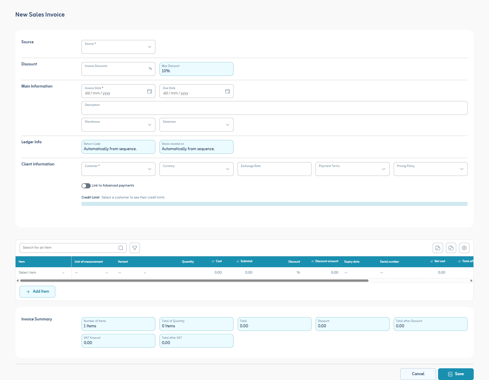
The rail design — a left title column naming each group of fields, with a full-width item table below
  • One column names every group
  • Max 7 fields per group
  • Keyboard shortcuts, Excel-style

Does it work?

v1.0 — legacy
40s
v1.5 — tabbed
50s
v2.0 — rail
25s
v1.0 — legacy
40s
v1.5 — tabbed
50s
v2.0 — rail
25s
37.5% faster than the legacy screen

Per invoice, measured to the first line item added.

Source:
  • 20+ sessions in an A/B Testing, excluding outliers

Similar results everywhere

Sales Invoice

Before
40s
After
25s

Journal Entry

Before
35s
After
22s

Stock Transfer

Before
28s
After
18s
Onboarding of new clients
Before
3 days
After
1.5 days
Source:
  • 20+ sessions in an A/B Testing, excluding outliers
1/9
4 min read