White-Label SaaS POS

Designing for On-the-Go usage

I owned the End-to-End Design process for the tablet field Point of Sale, from initial wireframing to the final prototypes.
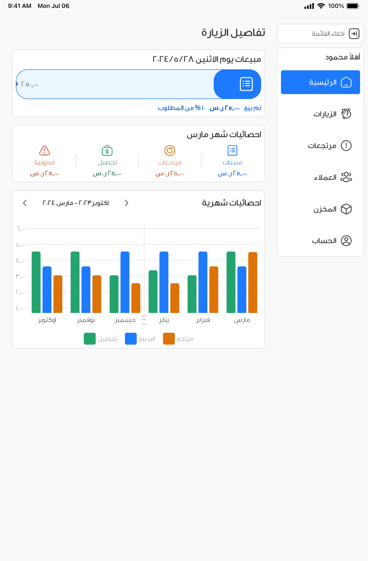
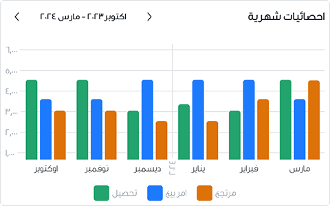
The home screen: today's sales, a monthly-statistics summary, and a bar chart of monthly performance, all in Arabic RTL
  1. 01 Foundational Research

    Tablet usage studies uncovered how users actually hold and use a tablet.

  2. 02 Token Architecture

    Built a 2-layer semantic token system to optimize design-to-code delivery.

  3. 03 Design and Prototype

    Designed the flows and navigation, and prototyping them.

Field Salesman Responsibilities

First, I had to understand who the app is serving and how

  1. 01 Loading & Unloading Stock

    Loads the van each morning and unloads what's left at day's end.

  2. 02 Checking and Planning Route

    Plans the day's client visits before leaving the depot.

  3. 03 Selling on the Spot

    Takes orders, returns and collections at the client's counter.

The Problem

Second, I had to define the highest points of friction in the manual process.

  1. 01 Offline Sales Invoices

    Orders and returns were written on paper, reconciled back at the office — not in real time.

  2. 02 Manual Count of Stock

    Van stock was counted by hand, so figures were always a day or more behind the field.

Designing for tablets

They're holding their tablets while walking, talking, and often with one hand

  1. On the Move

    Salesmen use their devices on the go.

  2. Thumb & Finger Reach

    Thumbs reach the edges; index fingers reach the centre.

  3. Imprecise Taps

    Taps are frequently inaccurate.

Design horizontally

  1. 01 Easiest Reach

    Reached using thumbs.

  2. 02 Regrip Reach

    Reached using "Hand Gymnastics".

  3. 03 Total Regrip

    Reached using index fingers.
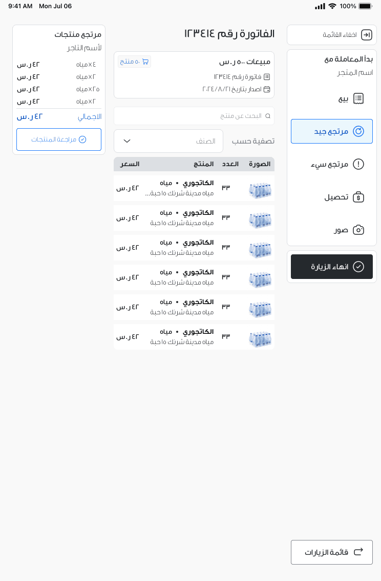
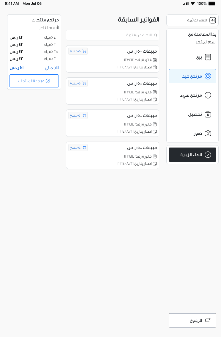
Good Return invoice screen: navigation and primary actions sit along the vertical edges, in the thumb's reach. Numbered callouts mark how often each zone is touched: rarely at the header, uncommonly at Good Return, commonly at End Visit.
  1. 01 Commonly used

    Navigation and main actions.

  2. 02 Uncommonly used

    One-time secondary actions.

  3. 03 Rarely used

    Read-only data and tertiary actions.

Forgiving interactions

Minimum Tappable area: 44px
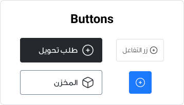
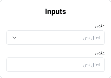
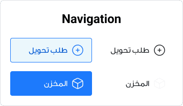
Buttons drawn at the minimum tappable sizeForm inputs drawn at the minimum tappable sizeNavigation items drawn at the minimum tappable size

Minimum space between targets: 8px
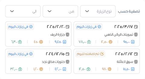
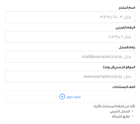
A dense form section spaced by the minimum gapA filter row spaced by the minimum gap

Simplified gestures:

The monthly chart paged with prev/next arrows instead of a pinch or swipe

Challenge: Salesmen need to focus on task at a time

Solution: Nested navigation

Create a side navigation that changes depending on the user flow
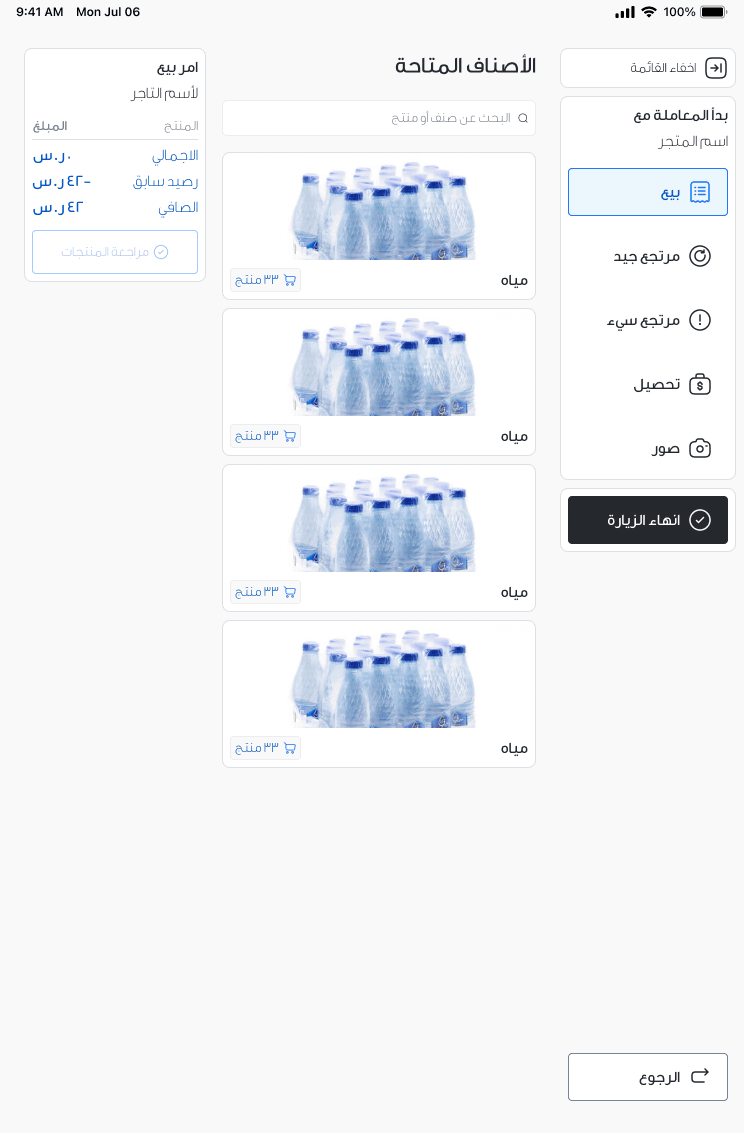
Sales order screen for the current visit, with the rail showing the visit's own steps
Good Return invoices screen for the current visit
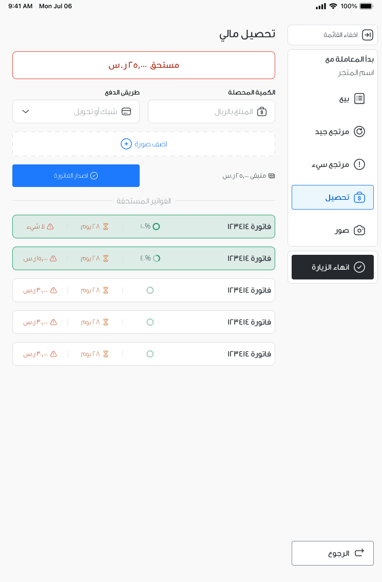
Collection screen for the current visit
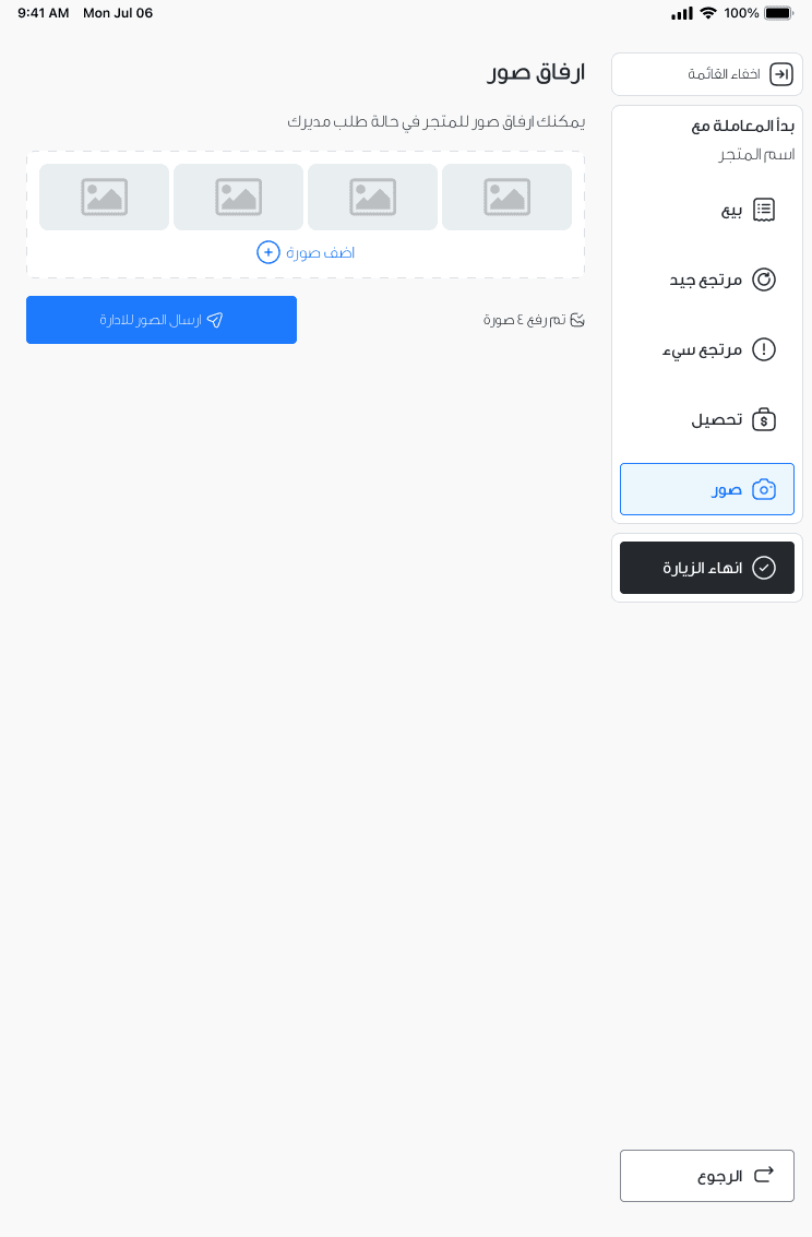
Uploaded photos screen for the current visit

Challenge: White-labeled App

We needed a system where branding could be switched quickly without new errors or requiring multiple app versions.

Brands are shown for demonstration purposes only and do not represent real clients.

Solution: 2-layer Semantic Design Token Architecture

We implemented a two-layer token system to separate core functionality from branding.

White-Label

Primary
Information
Neutral
Success
Warning
Error

Extra benefit: Light and Dark Theme ready per client

When a new brand is applied, the theme is exported in light and dark modes with the correct values of that brand. The tokens stay the same but the values differ. The developers don't need to touch the code, they only need to import the new tokens with a new file for that client.

1/11
5 min read